Did you know that when Google changed the shade of blue on their ad links, they earned an extra $200 million in annual revenue?
This simple UI adjustment had a massive impact on user interaction and company profits.
Some see these UI and UX as separate: UI deals with how things look, while UX focuses on how products work and feel.
While, we argue that they’re tightly linked. UI is the face of UX — the first thing users see and interact with.
Good UI design ensures that every click, swipe, and interaction feels intuitive and seamless, ultimately defining how satisfied users are with a product.
What is the aesthetic usability effect?
People have a natural bias towards aesthetics. This means users often perceive well-designed products as more usable, even if there’s no real improvement in efficiency or effectiveness.
A beautifully designed interface can make users feel more confident and satisfied, leading them to overlook minor usability issues. Conversely, a poorly designed interface can make even the most functional product feel difficult to use.
This is the aesthetic usability effect.
The tangible impact of visual aesthetics on the UX

1. First impressions
Aesthetic appeal plays a critical role in forming initial user impressions. When users first encounter a product, a well-designed interface creates a positive perception, making users more inclined to explore further.
This immediate positive impression can increase user curiosity and engagement from the outset.
2. User engagement:
When users find a product visually appealing, they are more likely to interact with it. Engaging visuals make the user experience more enjoyable, increasing the likelihood that users will spend more time on the platform and return in the future.
3. Perceived usability:
Aesthetics can enhance perceived usability, even if the functionality remains unchanged. Users often judge ease of use based on appearance. A well-designed interface makes a product seem simpler and more intuitive.
4. Brand perception:
How a product looks shapes how users see the brand. Consistent and attractive design makes a brand more memorable and trustworthy. Using the same colors and fonts that match the brand’s values can show professionalism and reliability. Poor design, however, can hurt a brand’s reputation and trustworthiness.
Core elements that impact the aesthetic-usability effect
1. Illustrations

Tines uses illustrations on their website to make it visually appealing, engaging, and explain complex info.
- Usability and clarity: Illustrations can aid in clarifying complex processes or instructions, visually guiding users through tasks or workflows. It reduces the learning curve, making interactions more intuitive and efficient.
- Brand personality: Unique and consistent illustration styles contribute to shaping brand identity and personality. They help differentiate a product/service, making it recognisable.
- Emotional connection: Illustrations evoke emotions and can establish a connection with users on a deeper level. They can convey feelings of empathy, joy, or inspiration.
2. Typography

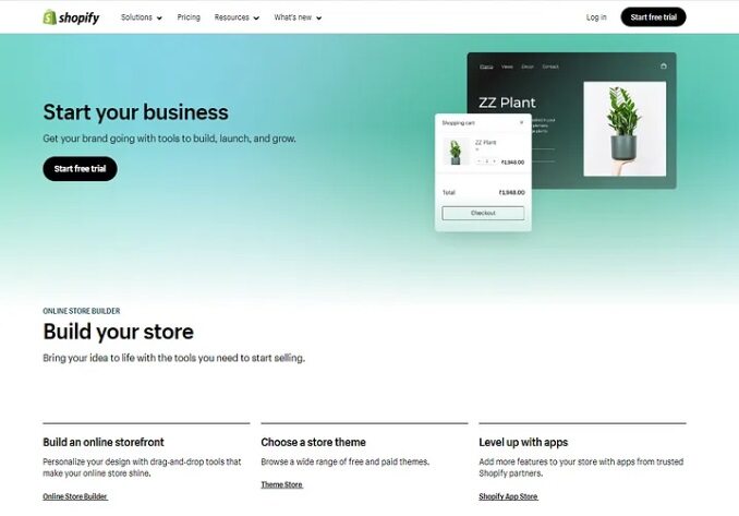
Shopify using clear layouts, visual hierarchy, and fonts to make info absorption easier.
- Visual hierarchy: Good typography enhances the visual hierarchy, guiding users to key points and improving overall comprehension.
- Readability: Well-chosen fonts, appropriate sizing, and balanced spacing make text easy to read, reducing eye strain and cognitive load.
- Information absorption: Clear typography helps users quickly absorb information and navigate through content efficiently.
3. Color theory

Netflix used red and black to give users the theatre feeling.
- Emotional impact: Colors evoke emotional responses; for example, blue can convey tranquility and professionalism, while yellow can evoke positivity and energy, influencing how users perceive and interact with a product.
- Navigation and focus: Colors can guide user navigation and emphasise important elements. It can bring attention to certain CTAs which designers want users to click.
- Brand recognition: When colors align with a brand’s personality and values, users develop a stronger connection and trust with the product.
4. Layout and white space

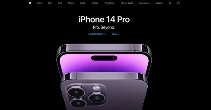
Apple uses ample negative space for visual focus on the iPhone, aesthetics, and better usability.
- Visual clarity: White space (or negative space) around elements helps in organising content and improving readability by reducing clutter and emphasising important information.
- User focus: Clear hierarchies guides user focus and attention. It helps with navigation and finding what they need quickly.
- Aesthetic appeal: A clean and uncluttered design looks more visually pleasing, creates a sense of sophistication, and spaciousness. It also communicates a sense of professionalism and usability.
5. Animations

Asana using whimsical unicorn animation for task completion for delight and completion feedback.
- Visual delight: Animations add a layer of delight to the user experience, creating a sense of polish and sophistication. They can make interactions feel more natural and fluid.
- Functional clarity: Animations can clarify functionality by showing relationships between elements and actions. For instance, hover animations on buttons can indicate clickable areas, improving usability and reducing confusion.
- Attention management: Animations can manage user attention effectively by drawing focus to important information or actions. They can guide users’ eyes through the interface, directing them to key features or content.
Rethinking the UI/UX Relationship
UI design goes beyond aesthetics — it encompasses function, usability, and guiding user behavior, all of which deeply influence user experience. Similar to how architecture lays the groundwork for a building’s usability, UI serves as the foundation for digital interactions, shaping how users navigate and engage with interfaces.
By prioritizing these elements alongside visual appeal, designers can create interfaces that not only look appealing but also function intuitively.
This blog is based on information written by Canvs Editorial, Muzli.
